Monday, 8 December 2014

Timed Assessment: Me as Makeup Artist

This time around I was makeup artist and I was happy because this was where I feel most comfortable with a brush in my hand working away. I came in to class, set up my work station in the a professional way and dressed in my black clothing. When Sue said we could begin, I took a quick browse of Georgina's notes to refresh myself and began with the base. Before I knew it, the 10 minute warning had gone off and I wasn't quite close to finishing the design but I didn't panic I just kept going and in the end did finish the design to a high standard that Georgina was happy and proud of.

I think I worked in a professional way and in a hygienic way. Once again my partner was very supportive and I feel like this is a must in stressful situations otherwise it just isn't fair.


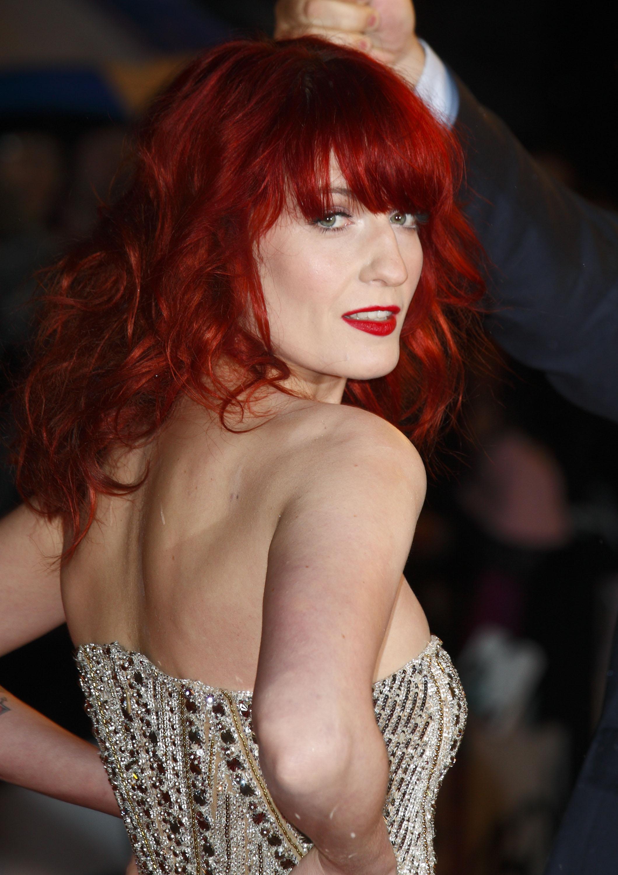
Overall I am exceptionally happy with how these images turned out, the colours really did show up well and I think my symmetry was spot on this time around. I am also very happy how the contour turned out as well. Overall I am very glad I had Georgina as a partner she was very supportive. 

Timed Assessment: Me as the Designer

For the first assessment it was my turn to be the Designer and Georgina's to be the makeup artist. I popped my step by step up for Georgina with pictures of the practice make up and my face chart on the mirror and waited for her to set up her work station which to me looked very professional and clean and tidy. The class was in a very relaxed environment, this was good because for our first hair assessment things started to go really wrong, very quickly, so we both said to each other not to panic this time around. We took this advice on board and sure enough the makeup was going brilliantly. The base was looking flawless and  my notes where reminding Georgina of the next steps to follow. Everything that we had talked about during the practice and design swaps Georgina took on board for the real thing. We both had a saying that 'attention to detail' which I think we both followed well.


ME AND JAMIE!
SELFIE WITH MY PARTNER! 
SELFIE WITH THE NEW ELIZABETHAN'S!!


I am really happy with how my design came out and how my images turned out, it was lovely to work with someone who has the same outlook on makeup and designing as I do, I think the partnership worked well and it was good to have a partner like this for our assessment. I think we were good at giving each other pep talks when we needed them or when we started to worry about our work. 

Design swap with Partner: Georgina's Design

I really love Georgina's design. I really love the symmetry and the orange and yellow against the white base, I think these colours will really stand out when coming to take a photographs.

I think its good how she's kept this Elizabethan white base but made it contemporary by adding yellow and orange. These were colours that weren't particularly see and used back then. 


Side view of Georgina's make up
Side view of Georgina's Elizabethan design
Front view of Georgina's make up


After completing the practice of my partner's make up I feel very confident in the fact that I will be able to complete this make up to a standard Georgina will appreciate with the time allocated to us. 

We used products like Illmasqua rich liquid foundation and supra colour to get a very good matte full coverage base.I then used Kryolan eye shadows to create the symmetrical eye make up. We then just white supra colour for the lips, liner and lashes. I set this all with white eye-shadow. 

My only fear for this make up is not getting both sides to match, I believe I have come up with a fool proof plan and that is to keep checking if they are even as I go by looking in my mirror and pulling the hair back off the face and standing behind Georgina to make sure they are equal. I wanted to be able to free hand draw on the make up with out using stencils, I feel this will benefit me better than just making a stencil because I need to practice my drawing anyway, so why not now. 


Sunday, 7 December 2014

Design swap with Partner and Practice: My Design

I gave my design to my partner and she started to practice my look. I had all trust in my partner that she would be able to deliver my look to the best it could be and she didn't disappoint me. I knew after seeing the practice run of the look that she would do wonderful on the day of the assessment.


In the practice she started by creating this perfect base and contour. At this point I was very happy with how my design was looking. I help guide her how I wanted my design to look and she was happy to take everything I wanted to say on board and help me develop my design further.


She then continued to follow my design asking questions on anything she was unsure about. She did they eye make up, then the blush and then the lips. She finished with brushing the eyebrows up. Georgina followed my design perfectly and was very helpful when I needed some guidance with making certain decisions on my design. Her make up application was done to such a hight standard. 

First Practice of Final Design


To be honest with myself I wasn't happy with the outcome of this practice. I knew I could do a lot better. The bad part was I had to rush as I only had about 25 minutes to apply this look. The foundation caked, the lips were the wrong shape and the I didn't get a chance to set the supra colour so it smudged everywhere. I am happy with my design but I needed more time to produce a piece of work that I would be proud of. Also my models skin was very dry and the foundation we used just didn't agree with the dry skin and the foundation started flaking off. Now, that would look like a caked on complexion they would have had in the Elizabethan times but for my look I wanted a flawless base and I wasn't happy with it. I'm happy with the colours and how they came out. I think they look vampy but still royal. I didn't get a chance to do anything with the eyebrows but if I had the plan was the brush them up and hold them into place with either a kind of wax of pritt stick.

Products used:
  • Supra colour in white and red 
  • Illamasqua skin base in white
  • Illamasqua translucent loose powder
  • Illamasqua contour powder
  • Illamasqua gold eye shadow in vintage
  • Kyrolan and crown brushes


Neil Gortons Prosthetics Event

http://www.theprostheticsevent.co.uk/
Sunday the 16th of November a few from our group went to Birmingham for Neil Gortons prosthetics event. It was like a day full of lots of interesting lectures. We managed to make it just in time to catch the talks. The day was very interesting and worth the money. We got given a lot of interesting information in all aspects of special effects. 

Animatronic Orangutan

Orangutan 


The real eye company 

Elizabethan make up application

INSPIRATION!!

BODY PAINTING WITH A BABY!

SO AMAZING!


FINAL LOOK!


It was a very good but very long day! I learnt a lot and hope it is on again next year I would love to be able to attend again! 


Three Designs

DESIGN 1

DESIGN 2

DESIGN 3
These are my three face charts that I designed .

Design 1 is my vampy, gothic look using dark, deep reds and golds. I really like this look because I it reflects my personality and favourite make up trend. I love dark colours and I think the this colour scheme will match my skin tone and eye colour very well. Gold really brings the blue out in eyes and as I will be wearing this look my eyes will look very blue and that is what I want for my look. 

Design 2 is my second favourite design and I was going for a pretty Elizabethan look. I think in the Elizabethan times women wanted to look womanly but to be honest didn't with how their faces looked. I think pink is a very feminine colour and the love heart lips makes this look cute and girly. 

Design 3 is unfortunately my least favourite because it didn't quite turn out the way I wanted or at least hoped for. I couldn't decide on the best placement of the colours and I think this would end up looking like very colourful black eyes when applied. ( whoops!) 


Contemporary make up inspiration


For some inspiration I looked at  royal colours for my final design, I class royal colours reds, golds any colours that you would normally see in portraits with Queen Elizabeth I in. 

https://blogger.googleusercontent.com/img/b/R29vZ2xl/AVvXsEgAtV41lsRHFNWm2Y_QwxM_wOmo4D6NeZQxYSWT8GNYHze5Y3qIEpH7SNOew9lhmWIV1h_CBxej3cNgjXEJeQebmrkVdi-oDYwCoLq4m61WWzvTA5QCTnwoPaUiORitSTx9IEEFyarVZk0/s400/01-Elle-beauty-best-in-show-fall-0912-jpg-xln-lgn.jpeg
http://1.bp.blogspot.com/-tIs4M
SJ_xlE/UE3sCfGz4kI/AAAAA
AAARWc/METEj-_29kE/s400/01-Elle-beaut
y-best-in-show-fall-0912-jpg-xln-lgn.jpeg
http://makeupforlife.net/wp-content/uploads/2
012/02/bleached-brows-red-lips-g
ucci-fall-2012-runway.jpg
I really love the strong lips in these pictures. I think the red is a really nice contrast against a pale complexion and the gold make it look almost dark, depending on what shade of gold you use. 
http://makeupforlife.net/wp-content/uploads/2012/05/2012-met-ball-makeup-dark-vampy-lips.jpg
I am unsure what shade of red I would go for, perhaps more of a purple red, or a brown or a deep ruby red. I think the deep purple reds look for vampy and that's something I think I want to go for with my design.

I also looked pinks and lilacs, I think this is a playful colour and something that you wouldn't normally see in the Elizabethan era.


http://media-cache-ak0.pinimg.com/236x/d3/
22/24/d3222463cdc2e9
dbc7757024b5317239.jpg
Signal blue and lilac shadow on cheeks and above eyebrow, red orange tinge over cheek and under eyebrows & corners of eyes, lilac pink lips, blue eyes, white-blonde hair.
https://s-media-cache-ak
0.pinimg.com/736x/ea/a9/b8/ea
a9b8f2f2bab085108025d4a9c82cc0.jpg


I looked at stronger contours that integrate with the eye make its self, like this one that uses purple and and bronze which I think compliment each other beautifully. Elizabethans seemed to focus most of their makeup on the cheeks and the lips, so I looked at make ups that looked like they mainly focused on these two facial features like this one on the right which has strong cheeks and lips but the eyes are very bare. I like this idea, it makes it look contemporary by bringing the blush firther up to the temples as the Elizabethans only focused on the natural flushed area which was the apples of the cheeks.

FLOWERBOMB // VISION MAGAZINE on Behance
https://uk.pinterest.com/pin/554505772841780899/
This image really stood out to me because of it was mixing all the elements together that I wanted to base my design off. The dark vampy lip and pink on the cheeks and peachy pink on the eyes. Even though this colours shouldn't go together they do and it looks really lovely. It looks dark and slightly gothic by the same time girly and pretty. 

My New Elizabethan

http://www.imgth.com/images/2012/07
/16/florence-welch_6a5afawvmhb.jpg
My new Elizabethan is a singer I am very fond of. It is Florence Welch from the indie band Florence and the Machine. My reasoning behind her being a modern day Elizabethan is because of the way she looks. I think her whole look is like a modern version of an Elizabethan. She has beautiful red hair which is normally styled in curls just like the Elizabethans wore and in particular Queen Elizabeth I. She has a very pale complexion which is something that would have been a fashion in the Elizabethan times. All of her red carpet looks she is dressed in beautiful gowns just like the picture to the left where she has jewels and embellishments all over it, once again something that the Elizabethans loved to do was dress flamboyant.

Even on stage performing Florence Welch dresses beautiful and acts in like such a lady like manor. Just how I imagine Queen Elizabeth I would have acted to her court and her people. 


Dog days are over 
https://estotevaagustar.files.wordpress.com/2011/07/florence-and-the-machine-dog-days-are-over1.jpg
There is a music video in particular that I think she is most dressed like an Elizabethan and that is for the 2010 version of 'Dog days are over'. Her hair and make up just screams Elizabethan to me! She has tight red curls, a pale complexion and with red cheeks and it covered in jewels and expensive clothes. 

She even claims her style is like Ophelia's from Shakespeare's 'Hamlet' which was a play written during the Elizabethan times. 

Taken from youtube http://youtu.be/iWOyfLBYtuU

The Taming of the Shrew Review


THE TAMING OF THE SHREW REVIEW 
http://3.bp.blogspot.com/-KdLbbc47F0Q/Uc9Xg3L9Y4I/
AAAAAAAATUk/zTw_S4Aq_Y0/s1096/The
+Taming+of+the+Shrew+2005+TV.jpg
This is a 2005 modern version of the very popular comedy written by Elizabethan himself William Shakespeare. This version is written by Sally Wainwright and she has told the story very well. The actors were picked up and give the film great comedy value. 

This stars Shirley Henderson as Kate Minola who is a successful politician who wants to run for prime minister. The only way she can go about doing this is to get married. Being someone who has never been on a date and is still a virgin at in her mid years, this is proving to be difficult as most people irritate her. Then comes along Petruchio who at first thinks he can win a bet and marry this woman who most people think is cold hearted. He manages to marry her and ends up falling madly in love with her which was not part of the plan. 

Kate's sister Bianca is nothing like Kate. She made her career in modelling and wears expensive items like furs and silks. I think Bianca is the modern New Elizabethan in this film because of the way she dresses. She wears expensive clothes, looks after her hair, her makeup and the way she just generally looks. Just the way Queen Elizabeth did, in fact that's what Elizabeth built her image on. 


Jamie Murray as Bianca Minola
http://www.bbc.co.uk/staticarchive/91
bb3fab67b99971321e4917758fe9fb78360f4.jpg